Neon aesthetics have transcended their origins in urban nightlife to become the defining visual language of futuristic digital interfaces. In educational technology, these glowing blue and green highlights serve far more than decorative purposes—they create cognitive pathways that enhance learning and engagement.
The Psychology Behind Neon Colors
Color psychology plays a crucial role in interface design, particularly in educational contexts where sustained attention is paramount. Blue wavelengths have been scientifically proven to enhance focus and cognitive performance. Studies show that exposure to blue light increases alertness and improves reaction times, making it ideal for learning environments.
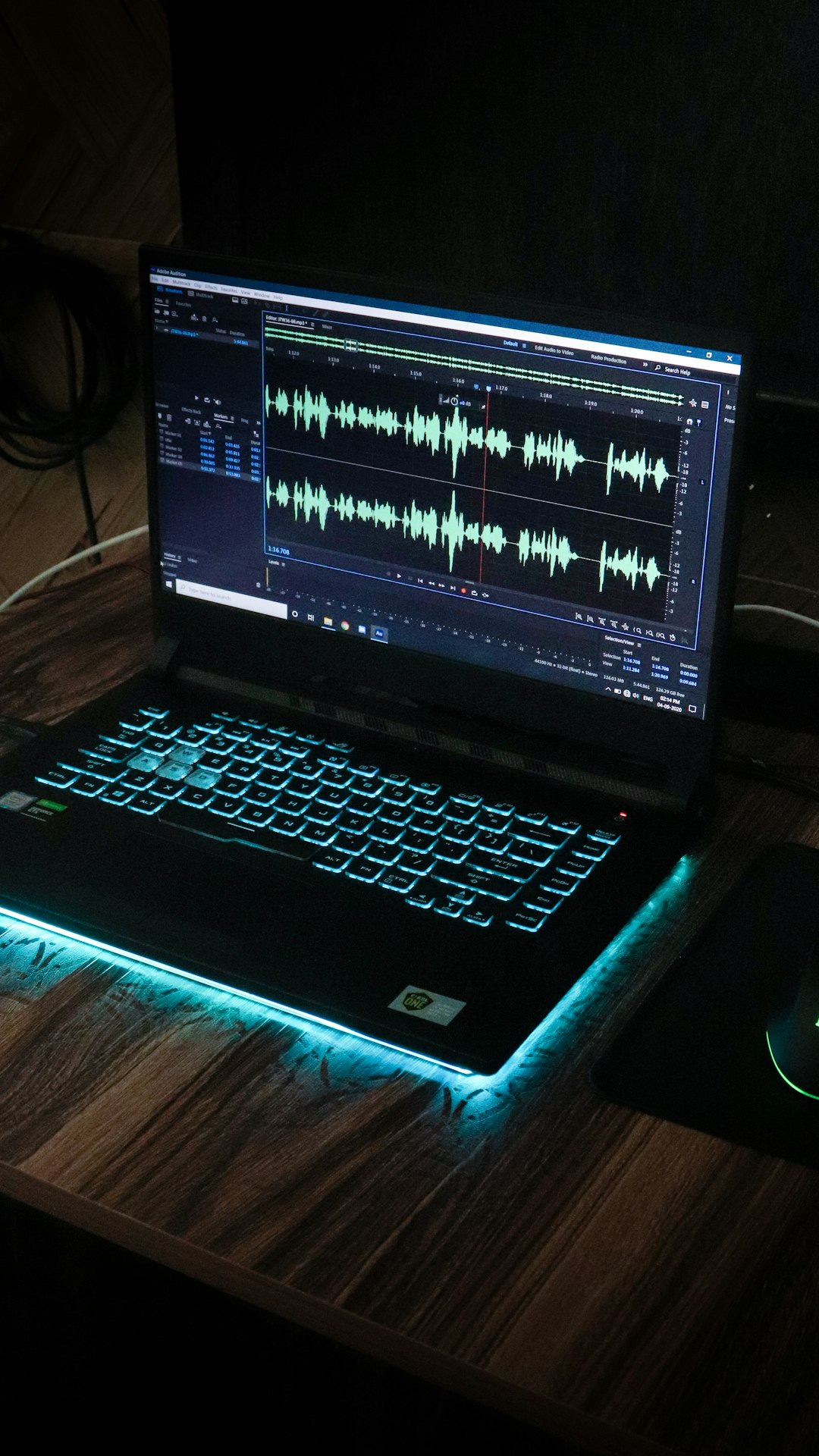
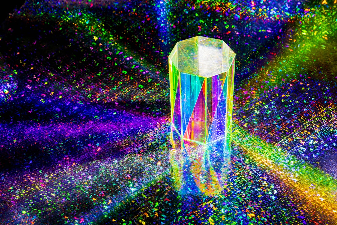
Green, meanwhile, reduces eye strain and promotes a sense of balance and harmony. When combined with blue in neon-style interfaces, these colors create a visual ecosystem that keeps learners engaged without causing fatigue during extended study sessions. The glow effect adds depth and dimensionality, making flat digital spaces feel more immersive and three-dimensional.
Historical Context: From Streets to Screens
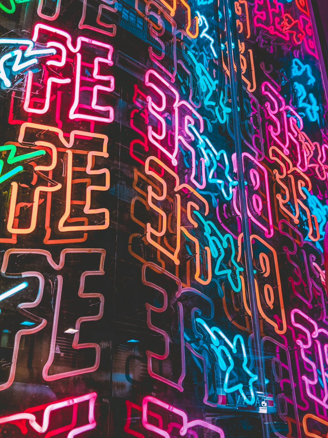
Neon signage originated in the early 20th century, transforming city landscapes into luminous wonderlands. The technology's ability to bend light into any shape made it perfect for advertising and artistic expression. Fast forward to the digital age, and designers have captured that same energy through glowing UI elements, gradients, and animated highlights.
In the 1980s, cyberpunk aesthetics popularized neon visuals in science fiction, associating these colors with advanced technology and futuristic societies. This cultural connection persists today, making neon design elements instantly recognizable as markers of cutting-edge innovation.
Technical Implementation in Educational Platforms
Creating effective neon design in digital interfaces requires careful balance. Too much glow can overwhelm users and reduce readability, while too little fails to achieve the desired aesthetic impact. At Four Meve AI, we've developed design systems that optimize neon elements for maximum effectiveness.
Our approach involves layered transparency, strategic blur effects, and carefully calibrated color temperatures. Each glowing element serves a functional purpose: highlighting interactive components, drawing attention to important information, or providing visual feedback for user actions. The neon isn't arbitrary decoration—it's functional beauty that guides the learning experience.
Contrast and Accessibility
One challenge with neon aesthetics is maintaining accessibility standards. Bright colors on dark backgrounds can create readability issues for some users. Our design team has addressed this through multiple contrast ratios, adjustable brightness settings, and alternative color schemes that preserve the futuristic aesthetic while ensuring WCAG compliance.
We've also implemented intelligent color adaptation algorithms that adjust hue and intensity based on ambient light conditions and user preferences. This ensures the interface remains visually striking without compromising usability or causing discomfort during extended learning sessions.
Animation and Motion Design
Static neon elements are compelling, but animation brings them to life. Subtle pulsing effects, trailing glow on cursor movements, and smooth transitions between interface states create a sense of fluidity and responsiveness. These micro-interactions provide immediate feedback, making the interface feel alive and reactive to user input.
Our animation philosophy emphasizes purposeful motion. Every animated element serves to guide user attention, communicate system status, or reinforce successful interactions. We avoid gratuitous animation that distracts from educational content, instead using motion design as a tool to enhance comprehension and maintain engagement.
Typography in Neon Environments
Text readability in neon-heavy interfaces presents unique challenges. Standard fonts can appear weak against glowing backgrounds, while overly stylized typefaces sacrifice legibility. We've selected font families that balance futuristic aesthetics with clarity, using strategic weight variations and spacing to ensure text remains crisp and readable.
Headers often feature geometric sans-serif fonts that complement the tech-driven aesthetic, while body text uses more traditional typefaces optimized for extended reading. Careful attention to letter-spacing and line-height ensures comfortable reading experiences even against complex neon backgrounds.
The Role of Darkness
Neon elements require darkness to truly shine. Dark mode interfaces aren't just trendy—they're essential for creating the contrast needed to make glowing elements pop. Our platform's dark backgrounds serve as a canvas that amplifies the impact of blue and green highlights while reducing overall screen brightness.
This approach also offers practical benefits: reduced eye strain during nighttime study sessions, lower battery consumption on OLED displays, and improved focus by eliminating bright distractions from peripheral vision. The darkness becomes an active design element rather than simply the absence of light.
Cultural Resonance and User Expectations
Today's learners have grown up in a visual culture saturated with digital media, gaming interfaces, and social platforms. Neon aesthetics resonate with these digital natives because they signify innovation, creativity, and technological sophistication. By adopting this design language, educational platforms signal that they're forward-thinking and aligned with contemporary visual standards.
This cultural alignment reduces cognitive friction. Users intuitively understand that glowing elements are interactive, that brighter colors indicate higher importance, and that smooth animations signify successful actions. These design conventions have become universal language in digital interfaces.
Future Directions
As display technology advances, opportunities for more sophisticated neon design expand. HDR displays with wider color gamuts can reproduce more vibrant and nuanced glows. Holographic displays will add true depth to neon elements, making them appear to float in three-dimensional space. Augmented reality interfaces will bring neon design into physical environments, overlaying educational content onto the real world with stunning visual effects.
At Four Meve AI, we're already experimenting with these emerging technologies, ensuring our design systems remain cutting-edge as the future unfolds. The neon aesthetic isn't a passing trend—it's an evolution in how humans interact with digital information, particularly in educational contexts where engagement and clarity are paramount. The glow of tomorrow's learning is bright, and it's painted in shades of blue and green.